How to create modal dialog with React
I often run into a question "How to create modal dialog with React". Modal dialogs are also something that I need to use from time to time in my own projects. So I thought that I'd share a simple re-usable Modal component with you guys and hopefully it might be of help for some of you. So let's get to it!
Check out also my post on 6 things every beginner React developer should know.
Creating a modal dialog with React is a bit different than the traditional Javascript way. In React you basically need two components. The actual Modal component which takes in as props the information if it should be open or closed (shown or hidden) and then a wrapper component that passes these props and takes care of managing them.
It is probably easier if you see the code for the Modal component first and then we go over it.
1import React from "react";
2import PropTypes from "prop-types";
3
4class Modal extends React.Component {
5  render() {
6    if (!this.props.isOpen) {
7      return null;
8    }
9
10    const BackgroundStyle = {
11      backgroundColor: "rgba(220,220,220,0.5)",
12      position: "fixed",
13      top: 0,
14      right: 0,
15      bottom: 0,
16      left: 0,
17    };
18
19    const ModalStyle = {
20      maxWidth: 400,
21      minHeight: 200,
22      backgroundColor: "#fff",
23      margin: "auto",
24      padding: 5,
25    };
26
27    const HeaderStyle = {
28      height: 20,
29      width: "100%",
30    };
31
32    const CloseBtnStyle = {
33      float: "right",
34      cursor: "pointer",
35      display: "block",
36    };
37
38    return (
39      <div style={BackgroundStyle}>
40        <div style={ModalStyle}>
41          <div style={HeaderStyle}>
42            <span style={CloseBtnStyle} onClick={this.props.onClose}>
43              X
44            </span>
45          </div>
46          {this.props.children}
47        </div>
48      </div>
49    );
50  }
51}
52
53Modal.propTypes = {
54  onClose: PropTypes.function,
55  isOpen: PropTypes.bool,
56  children: PropTypes.node,
57};
58
59export default Modal;
The Modal component really only needs the render-method. The most important part happens right at the beginning of the render method.
1if (!this.props.isOpen) {
2  return null;
3}
We check if the isOpen prop is true or false and based on that we decide if we continue rendering the Modal component. If it is false we just return null and no modal is rendered.
The render method also have some styling definitions that give the component the transparent gray background which covers everything under the modal and makes sure that only things on the modal can be clicked. The modal window has white background and is aligned in the middle of the screen. You can modify these style definitions to fit your preferences.
Wrapping our Modal component
I mentioned earlier that we need two components. We now have the Modal component but we still need a component we can wrap around it, a component that has the information if the modal should be open or closed. We will call it the App component in this example. Here is the code for our App component.
1import React from "react";
2import Modal from "./Modal";
3
4class App extends React.Component {
5  constructor(props) {
6    super(props);
7
8    this.toggleModal = this.toggleModal.bind(this);
9
10    this.state = {
11      isModalOpen: false,
12    };
13  }
14
15  toggleModal() {
16    const { isModalOpen } = this.state;
17    this.setState({ isModalOpen: !isModalOpen });
18  }
19
20  render() {
21    return (
22      <div>
23        <button onClick={this.toggleModal}>Open modal dialog</button>
24        <Modal isOpen={this.state.isModalOpen} onClose={this.toggleModal}>
25          <div>Hello CodePulse!</div>
26          <div>You can add your modal content here!</div>
27        </Modal>
28      </div>
29    );
30  }
31}
32
33export default App;
The App component has isModalOpen stored in its state. This is used (as you might guess) to determine if the modal is open or closed.
Another part we need to have is toggleModal method. It reverses the current value of isModalOpen. So if isModalOpen is false, toggleModal method will set it to true and vice versa. This causes the App component to re-render and as a result the Modal component will re-render also.
Lastly in the render method we render the Modal component and pass in isModalOpen as isOpen prop and the toggleModal method as onClose prop. This way when in the Modal component the onClose is called, it actually calls the App component's toggleModal method which will set the isModalOpen to false and cause a re-render which then hides the modal.
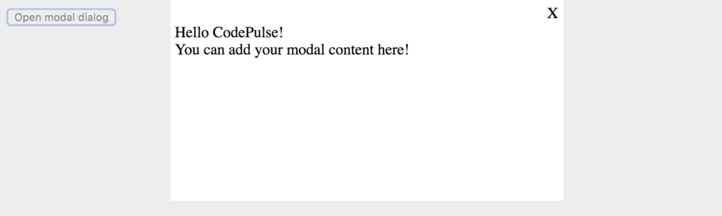 This is what the open modal dialog will look like
TL;DR
I created a codesandbox so you can see the whole code for this example. The codesandbox can be found here.
Conclusion
That is how you can create your own modal component. If you don't want to create a modal component by yourself, you might want to check out some of the ready made modal components out there e.g. react-modal.
I would like to hear from you so if you have any comments, please drop them below!
Remember also to subscribe to CodePulse newsletter, if you haven't already, to stay tuned on the latest news and posts about modern web development. Newsletters go out usually max once a month and you can unsubscribe anytime you want.